Building a Design System from the Ground Up
Achieving Design Consistency and Efficiency to Support Startup Growth
Project type
Freelance Project
Client
DT Master Carbon (Startup)
My role
Lead Product Designer

Challenge
The Need for an Adaptive Design System
When I joined the startup DT Master Carbon, my mission was to design an entirely new product from the ground up. In previous projects, the team had relied on borrowing styles and components from existing open design systems. As we developed new features for this product, it became clear that we needed our own design system to maintain visual consistency and improve design efficiency.
Process
Starting With the Style Guide
The design system needed to align with the brand's visual identity. At the time the Startup lacked a visual guide to reflect its branding, so my first task upon joining the team was to develop a comprehensive brand style guide. This involved refining the logo, defining a cohesive color palette, and establishing typography styles to ensure consistency and quality across all touchpoints.

Laying the Foundations
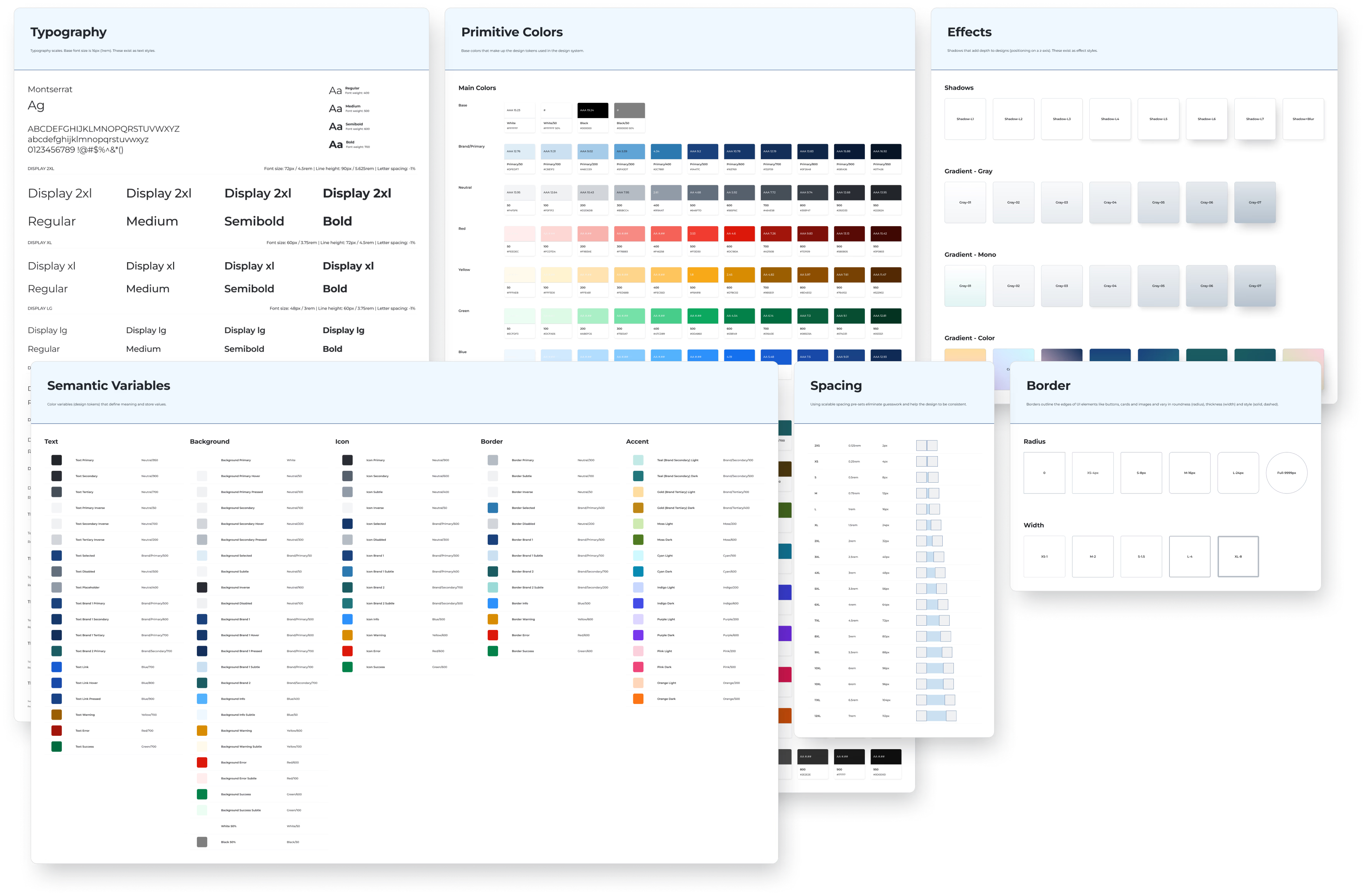
The next step was to establish the foundations of the design system and set up Figma variables and styles. This foundation included defining typography styles, primitive and semantic color variables, effect styles (shadows, gradients, and blurs), spacing guidelines, and border styles (radius and width). These elements are incorporated into the component library, ensuring the design system is coherent and scalable.
Building the Component Library
An Iterative Process
The main goal of the design system was to support the development of a new platform, but we couldn’t predict the exact components we would need. As a result, the component library was developed iteratively as the platform evolved. The early stages of designing a new product are often fast-paced and messy, requiring numerous trials and errors. I made sure to dedicate a few hours weekly or biweekly to clean up the components we had built and integrate them into the design system. This library continues to grow and evolve.
Atomic Design Approach
To keep the design system manageable and the components versatile, I utilized component properties and nested components whenever possible, guided by Atomic Design methodology.

Maintainability & reusability
Defining attributes and behaviors through component properties ensures design elements stay consistent and centralized while remaining interactive and flexible. This has significantly streamlined the design process by reducing redundancy and enabling quick adjustments.

Accessibility Considerations
To integrate accessibility in the design system, I ensured all components adhered to WCAG standards and inclusive design principles. This includes defining high-contrast color palettes for legibility, pairing icons with text in navigation and key actions, using clear state and alert label, and standardizing page and section headings with a logical hierarchy to support both visual clarity and screen reader navigation. These practices enhanced the design system to be user-friendly and inclusive.

Outcome
A Unified Design Language and Reduced Design Time
Achieved visual consistency across all platform features
Reduced design time by 50% through component reuse
Reduced miscommunication with team members
Laid the foundation for future growth, with the system supporting a new product expansion in 6 months
The design system continued to evolve and improve, playing a key role in maintaining design integrity across product lines.


© 2025
All rights reserved.